And Transformers.js aren't alone with experimenting with this, they're joined by WebLLM (docs), wllama (code), Flutter (code), and Emscripten (docs).
In a nutshell, this is the usual flow of using the API:
const hash ={algorithm:'SHA-256',value:'8f434346648f6b96df89dda901c5176b10a6d83961dd3c1ac88b59b2dc327aa4',};try{const handle =await navigator.crossOriginStorage.requestFileHandle(hash);// Cache hit! Get the file as a Blob and use it directly.const fileBlob =await handle.getFile();}catch{// Cache miss. Download from network, then store for next time.const fileBlob =awaitfetch('https://cdn.jsdelivr.net/.../ort-wasm-simd-threaded.asyncify.wasm').then(r=> r.blob());const handle =await navigator.crossOriginStorage.requestFileHandle(
hash,{create:true,origins:'*'},);const writableStream =await handle.createWritable();await writableStream.write(fileBlob);await writableStream.close();}
Like most millennials, I grew up with Napster, then Kazaa, then eDonkey2000, obviously CD rips, and of course LAN parties. Over the years, this has led to a large collection of completely legal MP3 files that I have backed up on two large external USB spinning disks that haven't spun for a long time now, but the files also exist on Google Drive.
These days, of course I pay for my music (we have the YouTube Music family plan), but I recently thought it'd be fun to revive my old MP3 collection. This blog post describes how to connect Google Drive to Music Assistant on Home Assistant.
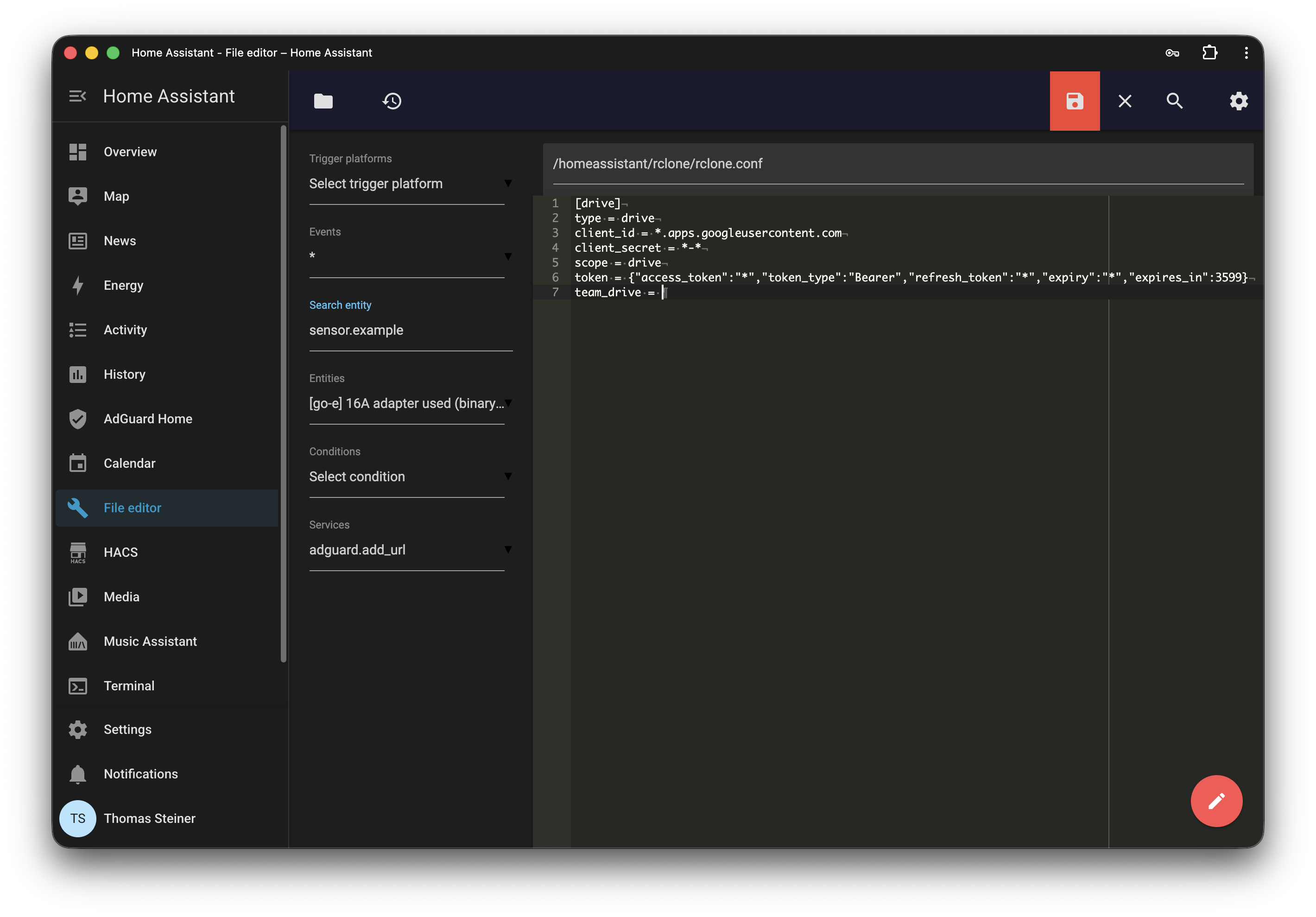
The first step is running rclone, a command-line program to manage files on cloud storage. Among many other providers, it supports Google Drive. Download rclone to your regular computer (that is, very likely, not your Home Assistant), and then follow the instructions to configure rclone for Google Drive. This requires you to go through the hell that is Google's Cloud Console, but it's a one-time setup. All you need in the end is a configuration file that you then have to copy over to your Home Assistant. Essentially, you run the configuration wizard, show the configuration file, and then copy its contents.
rclone config
rclone config show
It should look something like the following snippet, but of course with your own client ID, client secret, and token:
In Home Assistant, use the File editor addon (app) and create a file called rclone.conf in the config/rclone directory. Paste the contents of your rclone configuration file into it and save it.
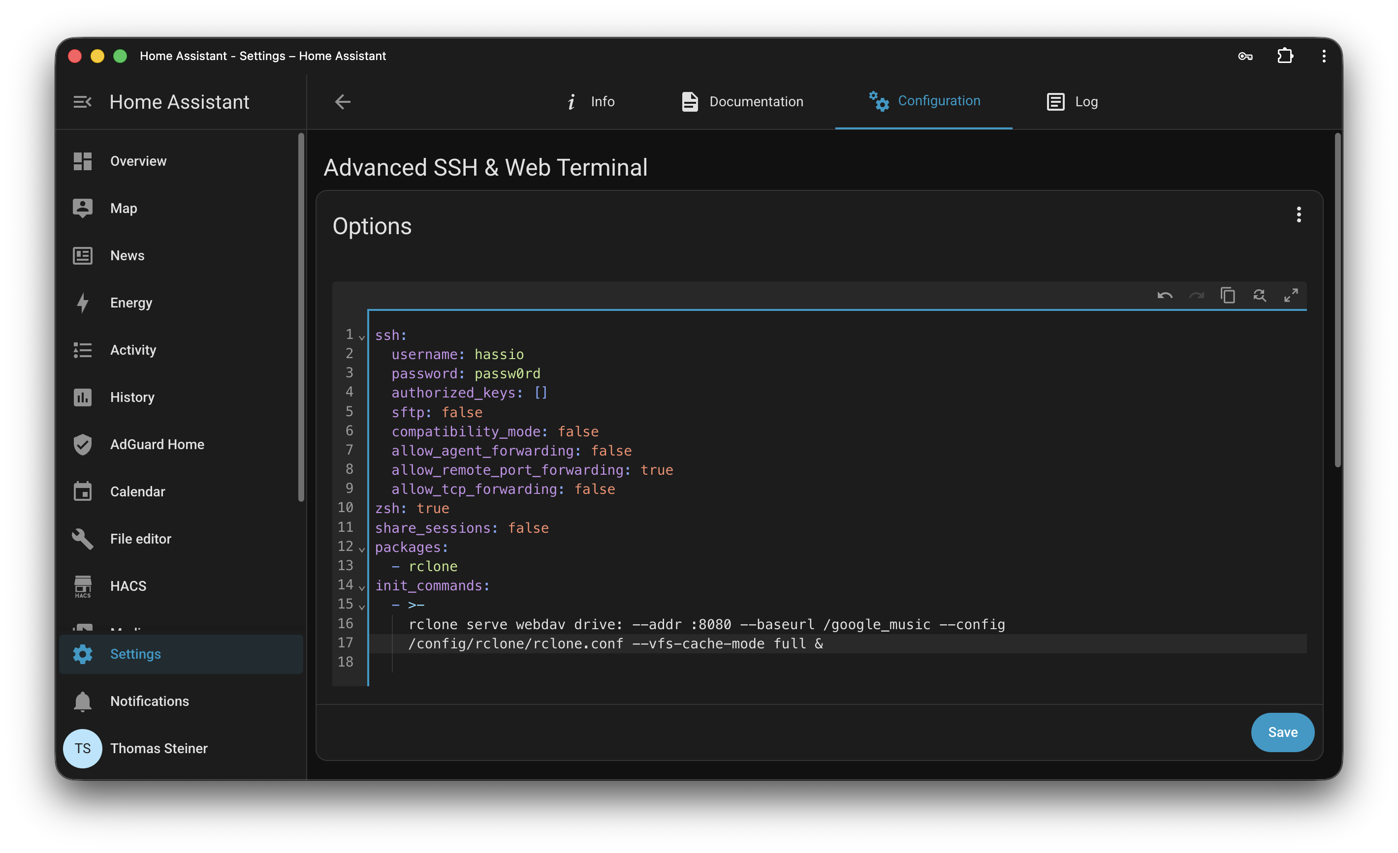
Now that you have the rclone configuration file in place, you need to set up rclone to serve your Google Drive as a WebDAV server. Install the Advanced SSH & Web Terminal app in Home Assistant. Open its Configuration tab and where it says Options, click the three dot menu and select Edit in YAML. Add the following configuration to it, which will install rclone and then start a WebDAV server on port 8080 that serves your Google Drive. This will be run automatically each time you start Home Assistant.
ssh:username: hassio
password: passw0rd # ⚠️ Change this to your own password!authorized_keys:[]sftp:falsecompatibility_mode:falseallow_agent_forwarding:falseallow_remote_port_forwarding:trueallow_tcp_forwarding:falsezsh:trueshare_sessions:falsepackages:- rclone
init_commands:->-rclone serve webdav drive:--addr :8080 --baseurl /google_music --config
/config/rclone/rclone.conf --vfs-cache-mode full &
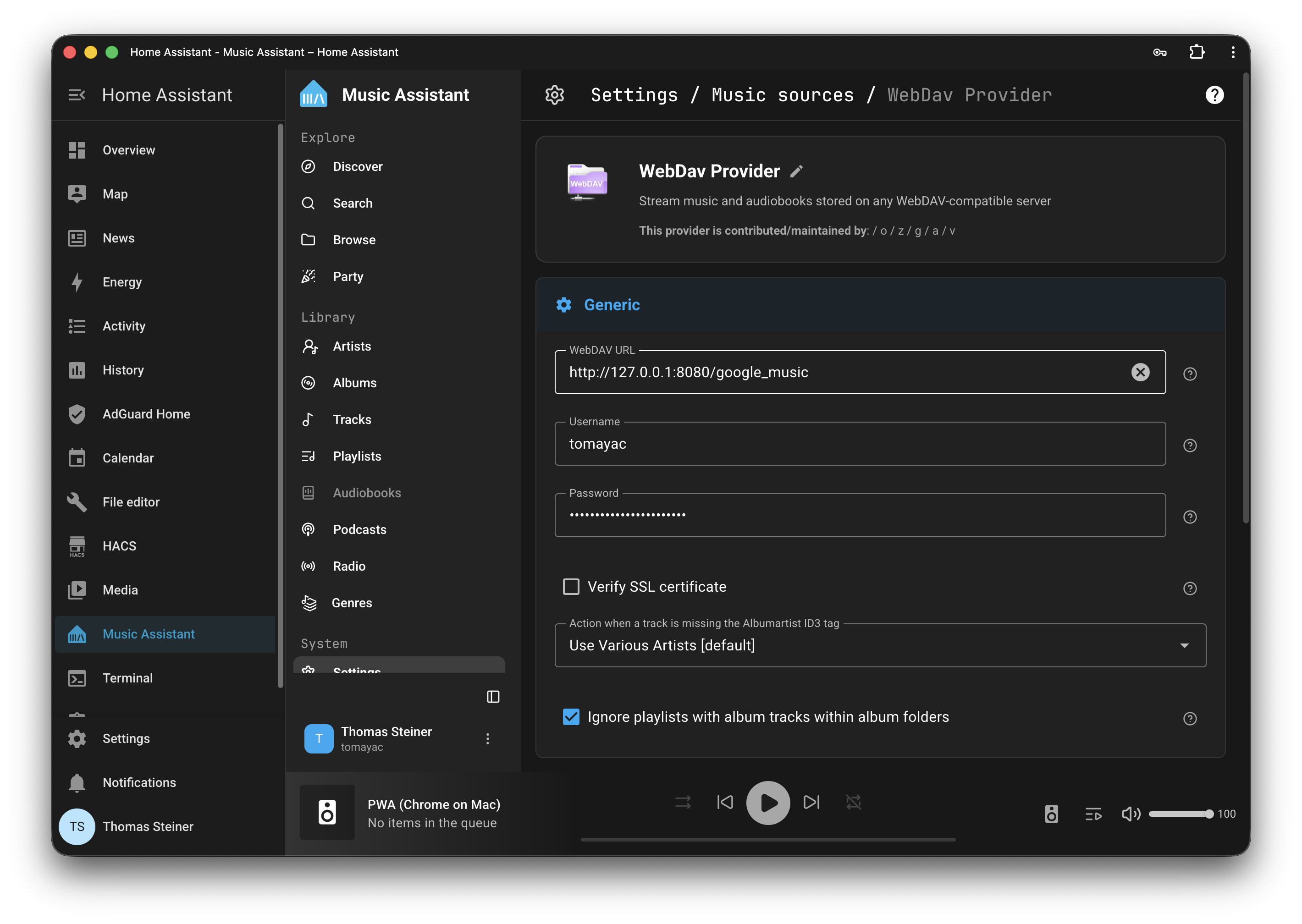
Connect Music Assistant to the rclone WebDAV server 🔗
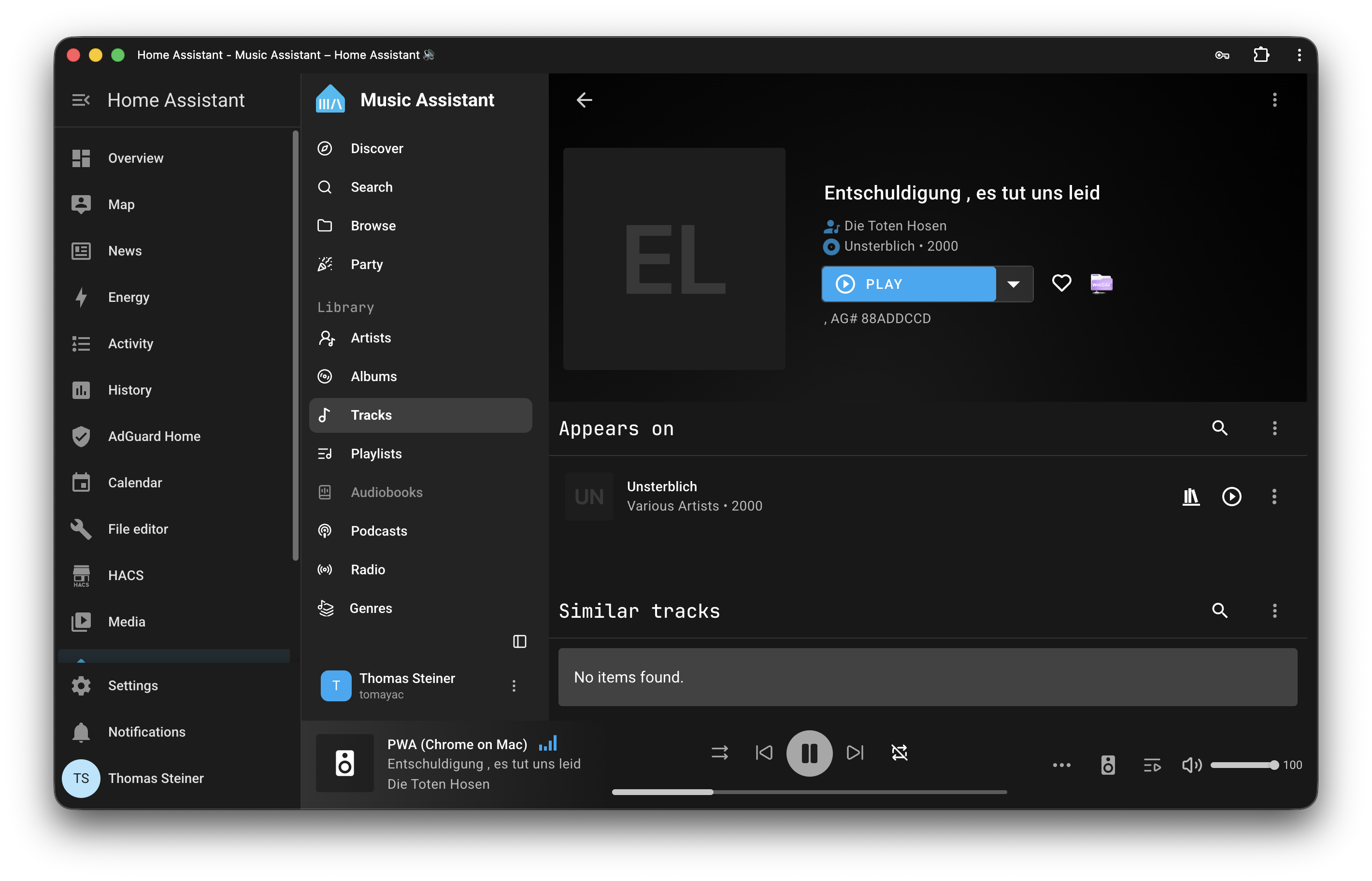
Finally, all you need to do is install Music Assistant and connect it to the WebDAV server that rclone is running. In Home Assistant, open the Music Assistant app and go to the Settings section. Click the Music sources button to add a new integration, and select WebDAV Provider from the list. Add http://127.0.0.1:8080/google_music as the WebDAV URL, and enter your username and password.
If all went well, you should now see your Google Drive music collection in Music Assistant and can browse it. Some will be embarrassing, some will have aged poorly, and some will bring back fond memories and be timeless. Enjoy the nostalgia!
If you like this blog post, please consider sharing it. Let's keep personal blogging alive! This post was hand-written by me with love and a cup of coffee, weird non-native English and all, hitting Esc a thousand times to keep the AI assistance away. If the post helped you, I always appreciate it if you let me know.
In Safari 17.4, the WebKit team at Apple
shipped a native HTML switch element.
The core idea is that an <input type="checkbox"> can progressively be enhanced
to become a switch by adding the switch attribute. Browsers that don't support
the switch attribute will just silently ignore it and render the switch as a
regular checkbox. At the time of this writing, Safari version 17.4 and later is
the only browser to support the new switch element natively. This blog post
introduces a polyfill that brings almost native support to browsers that
lack it.
The markup below shows you how you use the switch element. If your browser
doesn't support the element natively and you view this page on my blog directly
(that is, not in your feed reader), the polyfill should have already kicked in
and you should see two switch controls below the code sample: one regular
switch, and one with a red
accent-color.
<label>Toggle me <inputtype="checkbox"switchchecked/></label><style>.special{accent-color: red;}</style><label>Toggle me, I'm special <inputtype="checkbox"switchcheckedclass="special"/></label>
If a checkbox becomes a switch, the browser automatically applies the
ARIA switch
role. This role is functionally identical to the checkbox role, except that
instead of representing "checked" and "unchecked" states, which are fairly
generic in meaning, the switch role represents the states "on" and "off". The
polyfill does this for you.
When your users have the
prefers-contrast
setting enabled to convey that they prefer more contrast, the polyfill adds more
visible borders. Some operating systems like Windows or browsers like Firefox
additionally support a high contrast mode. The polyfill also has support for
that.
The macOS operating system additionally has an accessibility setting to
Differentiate without color,
which causes switch controls to get rendered with additional visual on/off
indicators. Since there is currently no direct CSS media query for this specific
preference, I opted to display these indicators whenever a high-contrast
preference is detected, ensuring maximum clarity for those who need it.
A common accessibility challenge with switches
identified in research (that
predates the HTML switch control) is an uncertainty whether the user should tap
or slide the switch to change its state. The polyfill, like the native
counterpart in Safari, supports both. Another challenge is whether the label
"on" indicates the current state of the switch or the resulting state after
interacting with it. I personally think smartphones—most notably the iPhone—have
taught people how to use switches, but I still recommend you do your own
usability research before adding a switch to your site.
The switch element was proposed to be included in HTML in
Issue #4180 filed in
November 2018. PR #9546 (opened in
July 2023) proposed a fix and was
approved
by Anne van Kesteren in August 2023. At the time
of this writing, the PR to the HTML spec is still open, with concerns from
several stakeholders, including from Google.
I am not and was not part of the standardization discussion around the element,
I just personally like the progressive enhancement pattern that reminds me of
the pattern used in
customizable <select> elements
that in the case of non-support just get rendered as regular selects.
You can
get the polyfill from npm
and find the code on GitHub.
The
README
has detailed usage instructions that I won't repeat here, including important
tips on how to avoid FOUC (Flash of Unstyled Content). You can also play with
a demo of the polyfill that
shows off more features of the polyfill, like all the various writing modes, and
the different ways to style the switch. And with that: happy switching!
Web Monetization gives publishers more revenue options and audiences more ways
to sustain the content they love. Support can take many forms: from a one-time
contribution to a continuous, pay-as-you-browse model. It all flows seamlessly
while people engage with the content they love. Publishers earn the moment
someone engages, while audiences contribute in real time, using a balance they
control.
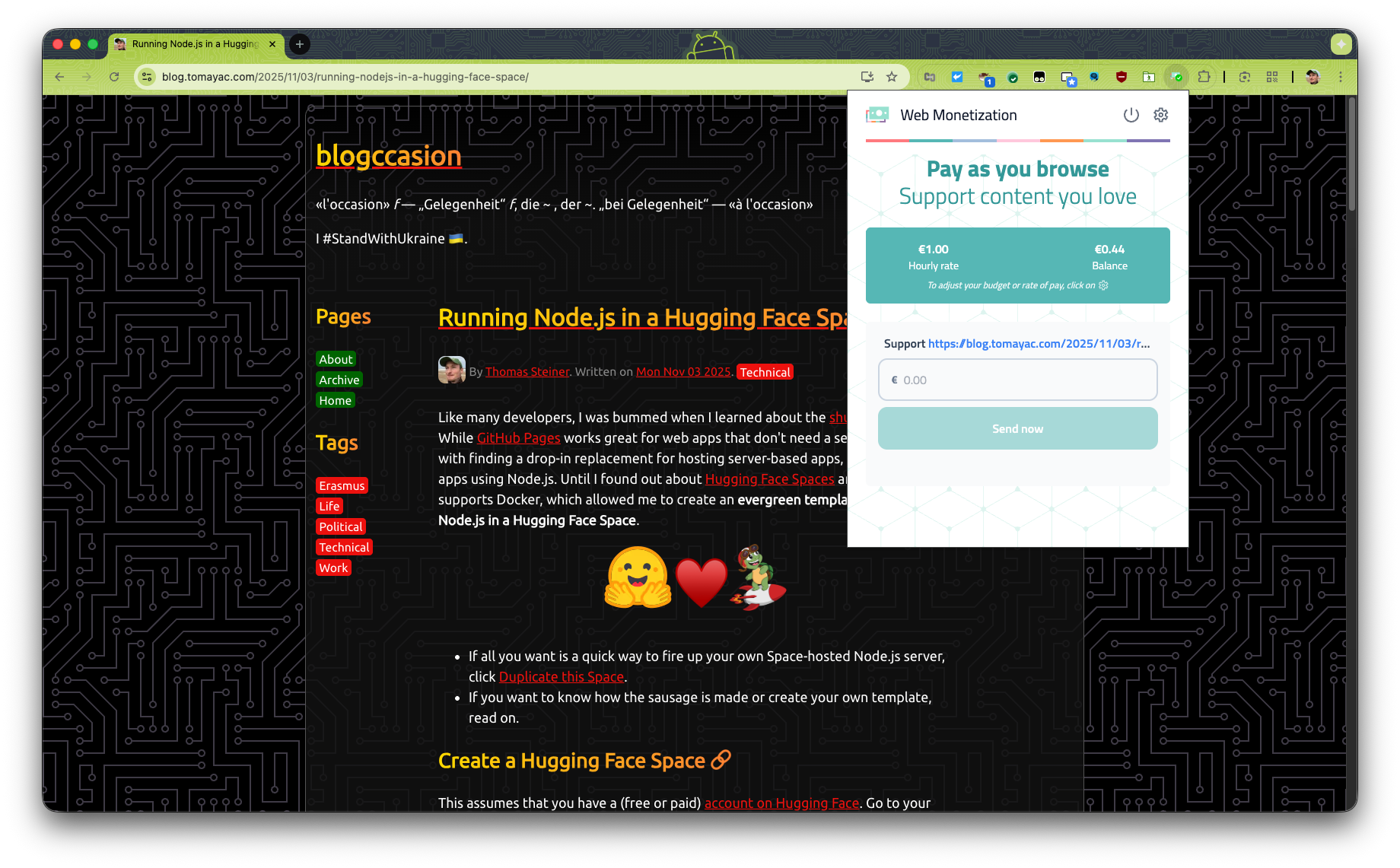
I encourage you all to give it a try! Install the
extension
that polyfills the proposed Web standard, get a wallet (I went with
GateHub, which works in US Dollars and Euros), and then
connect it to the extension.
You need to have funds in EUR (€) or USD ($). If you have crypto, it won't work,
which I've found out by trial and error, as I was part of
Coil, the Web Monetization predecessor, which paid out in
XRP.
Just to clarify, while you need a wallet—that typically is used for crypto—the
actual transactions are all in real fiat money, Euro in my case.
Connect your wallet, and browse to a page that supports Web Monetization. You
will notice whether a page is monetized when the extension has a green
checkmark. My blog happens to be monetized.
You can adjust how much you want to pay the site per hour and also send one-time
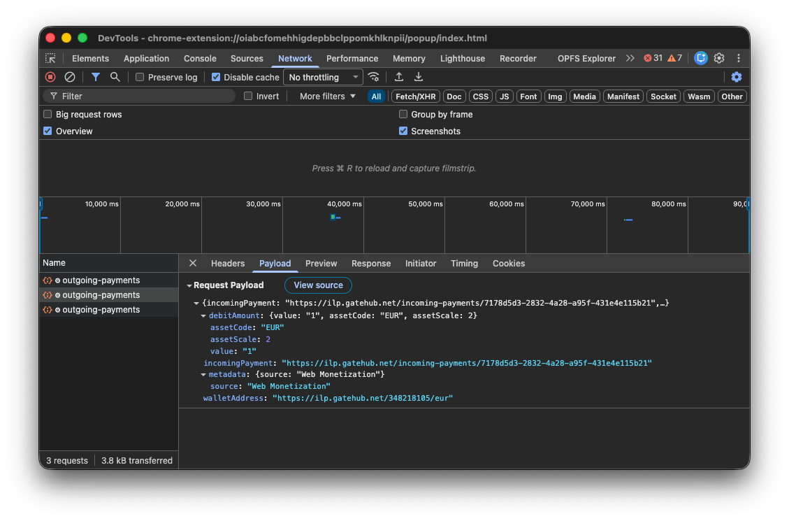
payments. The money is "streamed" every minute, which you can observe in
DevTools.
We actually have
code in Chromium
to make native Web Monetization happen, implemented by Igalia and funded by the
Interledger Foundation. I hope they can share the experiment results soon.
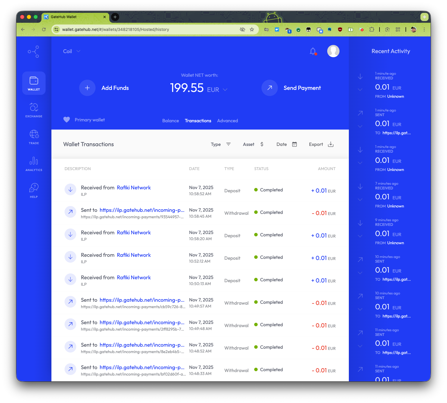
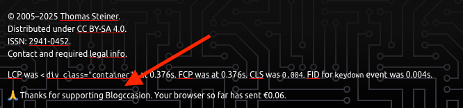
Then you're ready to receive payments. Here's me browsing my blog and seeing
payments go out from and come in to my GateHub wallet. This is of course
effectively a zero sum game, me paying myself. The 0.01 cent are the streamed
payments that go out and then come in again. I tested a one-time payment as
well. The 0.50 cents (not shown) was a successful one-time payment.
There's also a
JavaScript API, so you can
adjust the content of your page when your page notices that the user is paying.
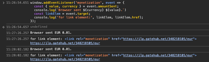
window.addEventListener('monetization',(event)=>{const{ value, currency }= event.amountSent;
console.log(`Browser sent ${currency}${value}.`);const linkElem = event.target;
console.log('for link element:', linkElem, linkElem.href);});
For testing purposes, you can observe these monetization events in Chrome
DevTools by pasting in the snippet above in the Console.
This way you could, for example, remove ads, or unlock an article when you
notice a one-time payment. On my blog, I just show a "thank you" message for
now.
I'm really bulli$h on this proposed standard. Hopefully someone else will try it
and let me know how it goes. I truly and honestly believe that this could be the
future for making the Web of tomorrow financially sustainable for publishers,
big and small.
Like many developers, I was bummed when I learned about the
shutdown of Glitch.
While GitHub Pages works great for web apps that
don't need a server, I struggled with finding a drop-in replacement for hosting
server-based apps, and specifically apps using Node.js. Until I found out about
Hugging Face Spaces and that it
supports Docker, which allowed me to create an evergreen template for running
Node.js in a Hugging Face Space.
♥️
If all you want is a quick way to fire up your own Space-hosted Node.js
server, click
Duplicate this Space.
If you want to know how the sausage is made or create your own template, read
on.
This assumes that you have a (free or paid)
account on Hugging Face. Go to your profile and
create a new Hugging Face Space using
Docker as the Space SDK. Go for the Blank Docker template. Leave all the
other settings unchanged, so you end up on the free tier. Choose if your Space
should be private or public.
The objective is to make this template evergreen, so no concrete version numbers
are hardwired. Instead, the idea is to hardwire the version numbers when you
duplicate the template to create a permanent Space.
Next, create the package.json file that your template should use. Note that
this uses "latest" as the Express.js version, as the template is meant to stay
evergreen.
{"name":"nodejs-template","version":"0.0.1","description":"A template for running Node.js in a Hugging Face Space.","keywords":["Node","Node.js","Hugging Face Space"],"repository":{"type":"git","url":"git@hf.co:spaces/tomayac/nodejs-template"},"license":"Apache-2.0","author":"Thomas Steiner (tomac@google.com)","type":"module","main":"index.js","scripts":{"start":"node index.js"},"dependencies":{"express":"latest"}}
As the next step, create a Dockerfile for your template. Again I'm using an
evergreen approach here with a Node.js Docker tag of lts-alpine, which means I
always get the LTS release of Node.js running on the lightweight Alpine Linux.
# Node base imageFROM node:lts-alpine# Switch to the "node" userUSER node# Set home to the user's home directoryENV HOME=/home/node PATH=/home/node/.local/bin:$PATH# Set the working directory to the user's home directoryWORKDIR$HOME/app# Moving file to user's home directoryADD . $HOME/app# Copy the current directory contents into the container at $HOME/app setting the owner to the userCOPY--chown=node . $HOME/app# Loading DependenciesRUN npm install# Expose application's default portEXPOSE 7860# Entry PointENTRYPOINT ["nodejs", "./index.js"]
Up next, create your default index.js file that your template should use when
the Node.js server starts. I went with the battle-proven Express.js server
framework. Note that the port needs to be 7860.
Now for the smart part: The code dynamically reads out the used Express.js and
Node.js version, so when you duplicate the template, you can hard-wire these
versions. After duplicating the template, in your code, update the highlighted
parts:
In your Dockerfile, replace node:lts-alpine
with, for example, node:24-alpine.
In your package.json file, replace "express":
"latest" with, for example, "express":
"^5.1.0".
import express from'express';const app =express();const port =7860;
app.get('/',async(req, res)=>{
res.send(`Running Express.js ${(awaitimport('express/package.json',{with:{type:'json'},})).default.version
} on Node.js ${process.version.split('.')[0].replace('v','')}`);});
app.listen(port,()=>{
console.log(`Example app listening on port ${port}`);});
To set some metadata for your template, create a README.md file with YAML
front matter at the beginning. Hugging Face makes this easy via its Web
interface for the standard parameters, but you can modify
many more parameters
as per the documentation.
---license: apache-2.0
title: Node.js template
sdk: docker
emoji: 🐢
colorFrom: green
colorTo: green
short_description: A template for running Node.js in a Hugging Face Space---
While you can edit files individually on Hugging Face's Space
Files view
with syntax highlighting and editing support, it's not a full-blown IDE, but you
can clone your Space with git and work on it locally (or with an online IDE
like VS Code).
And this is it really. Now you have a running Node.js app that you can
duplicate
whenever you need to spin up a Node.js server. The best is that this Space runs
in its own main browser context,
https://tomayac-nodejs-template.hf.space/
in the concrete case, not somewhere in an iframe, which means you can set
headers like
COOP
or
COEP
to get access to powerful features like
SharedArrayBuffer and friends. In
fact, Hugging Face even allows you to set these
custom_headers
by default in the YAML front matter config at the beginning of the README.md.
Note, though, that adding these headers means your app will only run in
standalone mode, but no longer in the default Space iframed view.
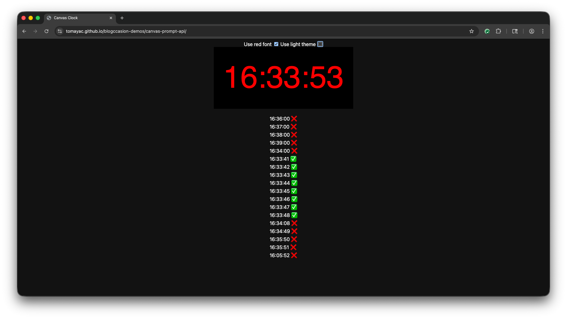
I was playing with stress-testing the
multimodal capabilities of the Prompt API
and thought a nice test case might be to have the model read the current time
painted on a <canvas>. As with my
last Prompt API exploration,
I'm again using a response constraint, the HH:mm:ss regular expression
/^([0-1][0-9]|2[0-3]):([0-5][0-9]):([0-5][0-9])$/. The prompt is "Read the
time that you can see in this image and print it in HH:mm:ss format."
To my surprise, the model (Gemini Nano in Chrome) seems to be quite
color-sensitive. I found that the model often gets the time wrong in dark mode
when a red font is used to paint on the canvas. (The
Canvas CSS system color
is #121212 in Chrome in dark mode.) I
checked the contrast
between CSS #ff0000 (that is, red) and CSS #121212 (that is, black-ish) and
it's 4.68:1, which for large text passes both WCAG AA and WCAG AAA.
Not something really super actionable, other than maybe a heads up to play with
color-preprocessing if the model's recognition performance is poorer than you
expected.
Oh, and almost forgot the results of my stress test: on my MacBook Pro 16-inch,
Nov 2024 with an Apple M4 Pro and 48 GB of RAM, the model was able to keep
up with about one complete (but not necessarily correct) prompt response per
second. (Yes, I know that this machine is not what the average user has.)
You can play with the
demo embedded
below, or check out the
source code
on GitHub. Toggle between light mode and dark mode and choose red or
CanvasText as the font color.
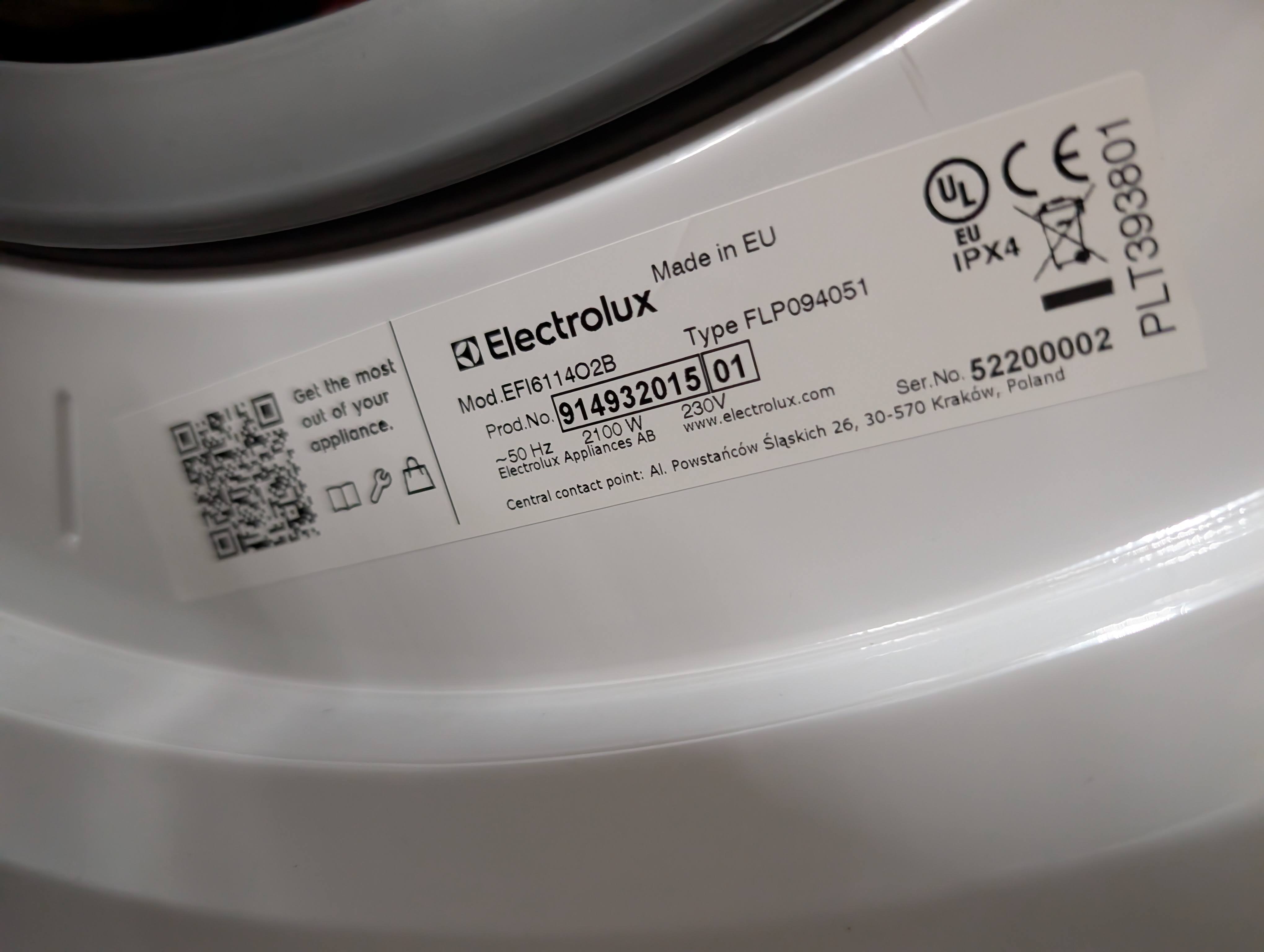
When I moved in with my wife Laura in 2005, we lived in a shared apartment in
Barcelona that had an ancient washing machine that was just there already, no
idea who initially bought it. I managed to break the washing machine door's
closing mechanism some time in 2006, so for a few weeks, whenever we did the
washing, we had to lean a chair against the door so it wouldn't open. At the
time, we were both students and living on a small budget.
Eventually, later in the same year, we bought an Electrolux machine that has
accompanied us ever since. First on our move to Hamburg, then there through
three apartments, and finally back to Spain, where we live now in the Catalonian
countryside. Anyway, the washing machine had a motor damage last week, so after
almost 20 years, it was time for a new one. I ordered it online (another
Electrolux, without Internet nor WiFi), it was delivered swiftly, and I
installed it hopefully correctly.
The washing machine came with a voluntary 10 year warranty if you registered it.
The brochure where this offer was announced featured a free telephone number and
a QR code that pointed at the number (in plain text, not making use of the
tel: protocol). I called the number, and to my absolute surprise there were
currently more callers than usual. After about 20 minutes, I had an agent on the
phone, but after saying what I wanted, they just hung up on me (or the
connection cut, whatever). Fine, I called again, but now, the call center was
over capacity and they didn't even let me enter in the wait loop.
They did offer to send me a link to a chat service on their website via SMS,
though, so I went for that option. The SMS literally pointed me at something
like https://www. broken up by a space and then example.com/gc/. When I
clicked the linkified example.com/gc/, I ended up on a broken site whose
certificate wasn't trusted. After fixing the link manually and prepending the
https://www. part, the page didn't load.
At this point I was close to giving up, but I had one last card that I wanted to
play: I searched Google for "electrolux warranty register", and it pointed me at
a site https://www.example.com/mypages/register-a-product/ as the first
result. This looked promising. The mypages already suggested that this was
gated behind a login, so I created an account, which was painless. (Turns out,
after having an account and being logged in, the chat URL also worked—what an
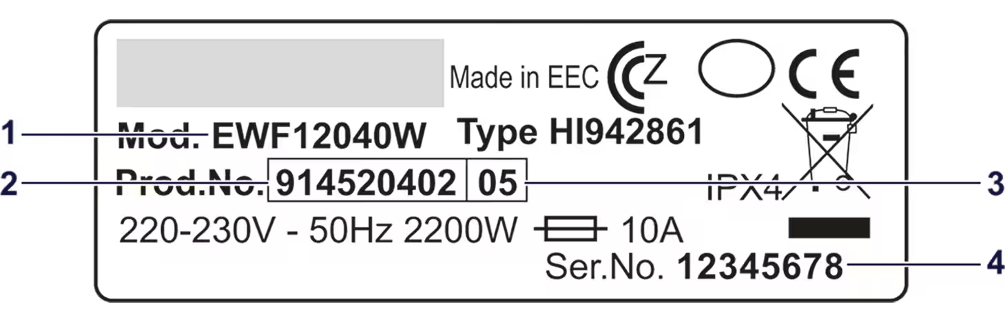
oversight on their part.) On the page, they had a field where you could enter
the washing machine's product number from the identification plate on the door
of the washing machine, together with helpful information where to find the
data.
But even better, they offered a service where you could just upload a picture of
the identification plate, and some AI on their server then extracted the product
number and let you register the product with two clicks. What a fantastic
experience compared to the crappy (and likely for the operator way more
expensive) call center experience.
Why they didn't just put this URL on the brochure and the QR code is beyond me.
As the title suggests: For all that's holy, can you just leverage the Web,
please? Don't make me talk to people! They could still offer to register the
machine by telephone as an alternative, but in 2025, the default for such things
should just be the Web.
Since I work on built-in AI as
my day job in the Chrome team at Google, I could not not notice this "extract
the product number from this identification plate" use case for client-side AI.
I coded up a quick
demo
using the Prompt API embedded
below that shows this in action. Here's a quick walkthrough of the code:
Create a session with the LanguageModel, informing the user of download
progress if the model needs to be downloaded, and telling the model about the
to-be-expected inputs (English texts and images) and outputs (English texts).
In the system prompt, I tell the model what its overall task is (identify
product numbers from photos of identification plates).
Prompt the model using the promptStreaming() method with a multimodal
prompt, one textual and one image. The Prompt API supports
structured output
in the form of a JSON Schema or regular expression. Product numbers have nine
digits, so I pass the regular expression /\d{9}/ as the
responseConstraint option.
Iterate over the chunks of the response. Since I'm just expecting nine
digits, this is probably a bit overkill, but, hey…
(Not shown) On the server, verify that the recognized product number actually
exist. Companies typically have some sort of verification rules like
checksums, or washing machine product numbers always start with 91 or
something. If you know those rules, you can of course make them part of the
responseConstraint, but you always need to verify untrusted user input
(which the output of an LLM counts as) on the server.
const session =await LanguageModel.create({monitor(m){
m.addEventListener('downloadprogress',(e)=>{
console.log(`Downloaded ${e.loaded *100}%.`);});},expectedInputs:[{type:'text',languages:['en']},{type:'image'}],expectedOutputs:[{type:'text',languages:['en']}],initialPrompts:[{role:'system',content:'Your task is to identify product numbers from photos of identification plates.',},],});const stream = session.promptStreaming([{role:'user',content:[{type:'text',value:'Extract the product number from this identification plate. It has nine digits and appears after the text "Prod.No.".',},{type:'image',value: image },],},],{responseConstraint:/\d{9}/,});forawait(const chunk of stream){
console.log(chunk);}
The other day, I was hit by a baffling TypeError: console.log(...) is not a function. Like, WTF 🤔? Turns out, I was sloppily adding a quick console.log('here') statement for debugging purposes (as one does 🙈), which happened to be right before an IIFE. I didn't put a ;, as it was a throwaway statement I'd remove after finding the bug, but turns out that's the issue. StackOverflow contributor Sebastian Simon had the explanation:
It's trying to pass function(){} as an argument to the return value of console.log() which itself is not a function but actually undefined (check typeof console.log();). This is because JavaScript interprets this as console.log()(function(){}). console.log however is a function.
Typically, sending non-default HTTP headers like COOP and COEP means controlling the server so you can configure it to send them. I recently learned that they are also honored if set through a service worker 🤯! This means you can make apps on static hosting like on GitHub Pages cross-origin isolated!
One example where cross-origin isolating your site is needed is with SQLite Wasm when you want to use persistent storage with the origin private file system virtual file system called OPFS sqlite3_vfs. I'm glad to have this coi-serviceworker trick up my sleeve now, and you do, too!


